
Burn up and burn down charts are visual representations of progress in the scope of a project, showing the amount of effort expended against expected output or set goals. Burn charts are common components of Agile and Scrum project management ideologies and are used to visualize progress for team leaders, stakeholders, and even team personnel.
This article looks at burn up and burn down charts, how they work, and how they differ from each other for organizations that want to visualize their objectives and project progress.
What Is a Burn Up Chart?
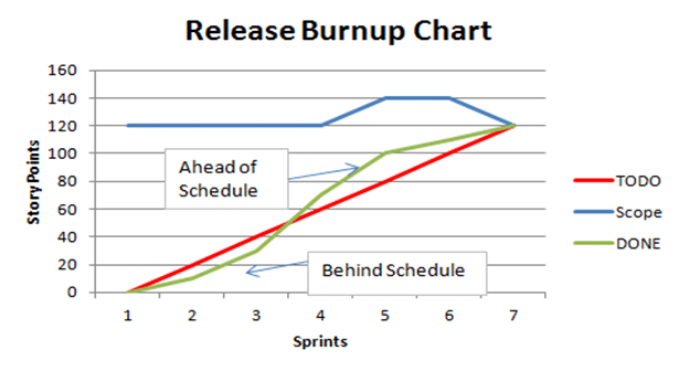
Burn up charts are visual representations that track work completed to date against the total work planned for a set time (e.g., project, sprint, or quarter). The total work planned often appears as a straight line—known as the scope—and serves as the team’s ultimate objective.
Beneath the scope line, burn up charts use two lines to represent progress over the course of the project. As seen below, the first line (red) represents “to dos” and goals for the project. It equally splits the effort across sprints to meet the project scope, while the second line (green) shows the actual progress made during each sprint of the project.
Read more: Best Project Management Software & Tools | TechRepublic
What Is a Burn Down Chart?
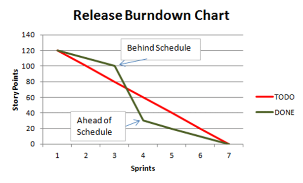
Burn down charts are visual representations of work remaining against work completed in a downward-sloping graph. Unlike burn up charts, burn down charts do not have a scope line because the X-axis serves as the ultimate destination for project completion.
Otherwise, the first line (red) shows a similar expected progress line that equally divides effort (also known as “points” within Agile planning) across the length of the project. The second line (green) likewise indicates actual progress per sprint to visualize gaps between expected and real progress.
Also read: Agile Principles: What They Are and Why They Matter | Developer.com
How Do Burn Charts Work?
Before jumping into the work, project managers and team leads determine the points needed to complete a project. Managers can then set a scope (or Y-axis starting point for burn down charts) and an expected progress line by sprint to track progress once a project starts.
Burn up and burn down charts can give teams visibility into progress or lack thereof to inform team planning and changes. As seen in the examples above, teams behind schedule in earlier sprints can make adjustments to get ahead of schedule until project completion.
For burn up charts, note the scope line (blue) shows that the objective changed during the project. Whether a client is asking for additional services or a new feature for a software update, project scopes can vary over time. Burn up charts offer the flexibility to show this variability.
While the expected progress line (red) is often a straight line pointed toward the end goal, this can also be a flexible line to show which sprints will require the most effort.
Burn Up Charts vs. Burn Down Charts
Burn up and burn down charts allow teams to track progress and adjust workflows as necessary to complete the project. While burn up charts use an upward slope and burn down charts use a downward slope, both charts contain a Y-axis to represent points or effort while the X-axis represents some degree of time.
Because of their similarities, whether to use a burn up or burn down chart is the personal preference of the team implementing the project management tool.
Moving up from zero or down from zero is the core visual appeal of each, but the burn up chart’s use of a scope line offers more flexibility for teams with regularly changing project expectations. Similarly, teams with a constant point expectation can use a burn down chart without worrying about plotting a scope.
Recent Coverage
- Best agile project management software | TechRepublic
- Top On-Demand Solutions for Project Management | Project-Management.com
- Best Bug Tracking Software & Tools | TechnologyAdvice
- Zenhub Project Management Review | Developer.com
- Zoho Sprints Review | Developer.com
- Best Scrum Tools & Software | Project-Management.com
- An Introduction to Agile Software Development | Developer.com
- 5 Agile Best Practices for Software Development | CIO Insight